Saturday, June 29, 2013

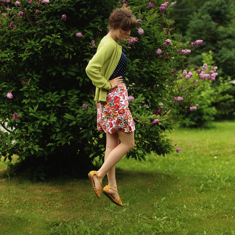
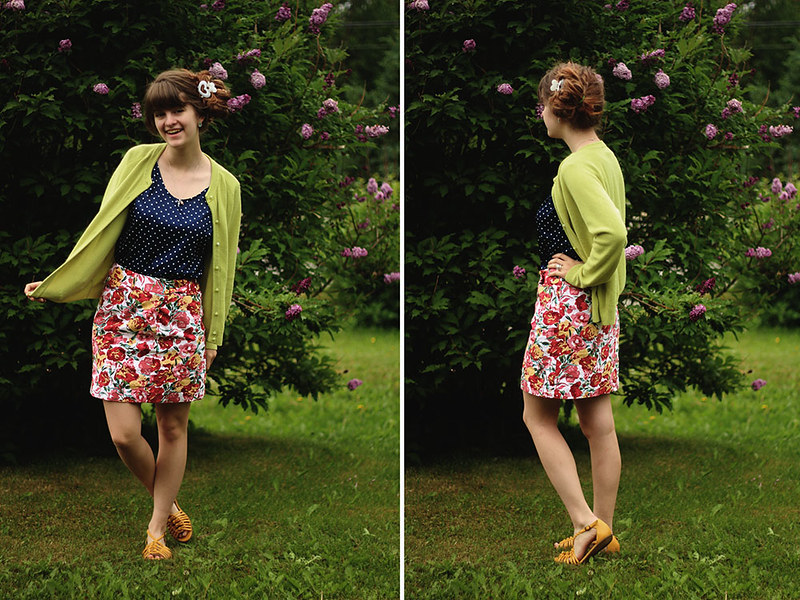
mixology results // neutral polka dots


shirt/skirt/cardigan: thrifted // shoes: payless
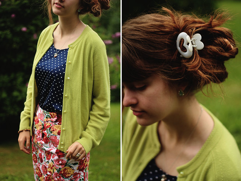


What if I told you guys that this week of mixology posts was just a huge conspiracy to get you guys to pick out my clothes for me? While that definitely is not the case, I still felt pretty cool when I woke up this morning and thought, "I wonder what I should wear today? Oh wait, I'll have my people decide for me!" Haha you are my people now. But all kidding aside, I really loved this outfit that Fernanda put together through my remix my closet post. Be sure to join in on the fun and read over all of my mixology posts from this past week! (intro//color//prints//combinations) I'll probably accept outfits until next week, and then it will be back to waking up and groggily picking out clothes in my half asleep daze every day.
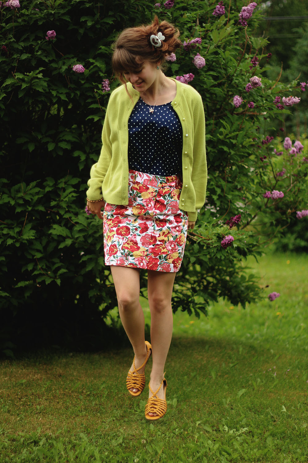


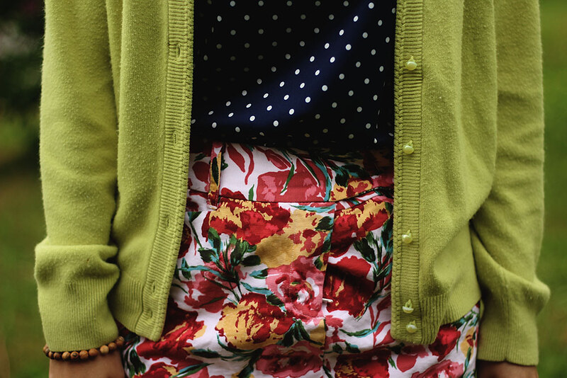
All of the pieces in this outfit really work well together. First let's look at the polka dot shirt. Neutral color, neutral print, therefore it goes with anything. The lime green cardigan is my accent color because there isn't the same tint of green anywhere else in the outfit, but there are the same tints of other colors in the skirt (mostly the yellow and light pink).



I hope you have a great day, and thanks for a great week of mixology! Tomorrow I'll have two posts, first my week in instagram (because I'm addicted to it and love posting pictures there), and then June's blogger of the month! Who's it gonna beee? And then following Monday's June Review post we shall continue these mixology results, so you don't want to miss it!


Friday, June 28, 2013

mixology 101 // remix my closet [closed]


Now it's time to put all that new knowledge to the test! If you're just joining in on this week of mixology, be sure to check out the previous posts here: intro//color//prints//combinations

I've pulled together some select pieces (basically my entire wardrobe) for you to mix together! You can choose as many pieces as you want, you can choose multiples pieces in one category, the point is that you're the stylist, and I'm your client! You have full reign. Comment below with how you would create an outfit with these colorful printed pieces. A great example comment would be something like this: "I would love to see the lace button down shirt over the striped shirt, with the purple pencil skirt." And then tomorrow (or in the next couple of days, depending on how many people participate), I'll style the outfit and show you why it was successful or not so much. I hope you have fun doing this!


Button-down shirts (could also be worn as cardigans, can be tied, can be worn under or on top of other pieces):
1. lace, 2. beige floral, 3. pink floral, 5. denim leaf print, 6. purple floral


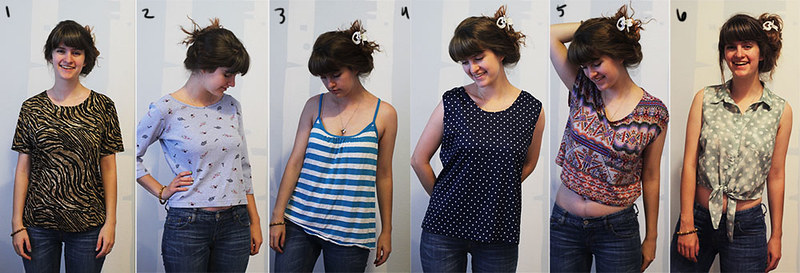
Regular shirts (can be worn tied, on top of other pieces):
1. zebra print, 2. floral, 3. striped, 4. polka dot, 5. crop top, 6. green polka dot


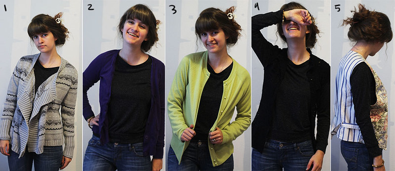
Cardigans:
1. gray, 2. purple, 3. green, 4. lace, 5. two-toned vest


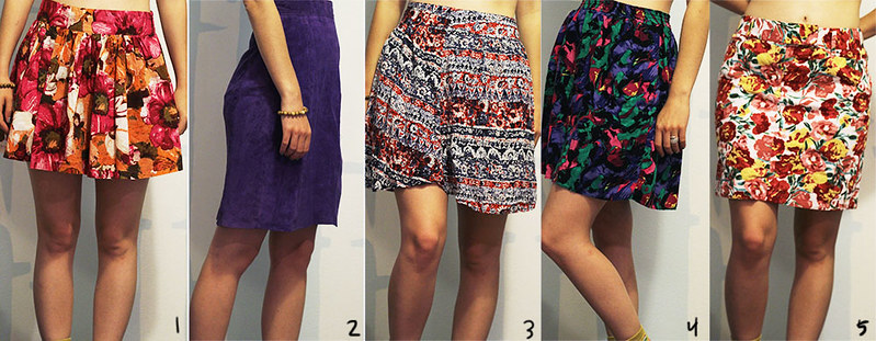
Skirts:
1. orange floral, 2. purple pencil, 3. pink/blue, 4. green multicolored, 5. yellow floral


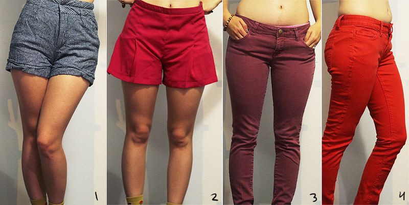
Pants:
1. High waisted striped, 2. pink shorts, 3. plum, 4. red


Dresses:
1. polka dot, 2. pink open back, 3. purple lace, 4. yellow zigzag, 5. ice cream, 6. geometric, 7. cherry


Legwear:
1. blue floral leggings, 2. pink/blue floral leggings, 3. lace tights, 4. green tights, 5. purple zigzag socks, 6. polka dot socks, 7. cupcake socks


Wednesday, June 26, 2013

mixology 101 // prints


Today we are talking all about patterns! Every image on this post can be viewed in its original color when you hover your mouse over it. It is essential to look at the patterns without color to distract, but more often than not you will see how impactful color is to the success of wearing multiple patterns at one time. Today I will talk about combining patterns themselves, and tomorrow we will focus on both colors and patterns. Be sure to check out yesterday's post on mixing colors here.

The topic of patterns is a bit harder, not only because patterns include color, but also because there isn't as much of a science involved with patterns. But today we will focus on the patterns themselves.

When I was younger, I wanted to be an interior designer when I grew up. Even though I probably won't do that for a living, many things from interior design coincide with creating outfits. In fact, I don't think there's anything that isn't related between the two. This is a great article about mixing prints that you should definitely read (it's short!), and I will translate a few them to the clothing world.


A lot of people are nervous to mix prints together, and for good reasons. There's a fine line between a good mix and a bad one. One good thing to keep in mind is that like colors, there are neutral patterns. Polka dots and stripes are the two most basic patterns, and can be combined with any other pattern, including other neutral patterns. They are also great geometric patterns and work excellently with organic patterns like florals.

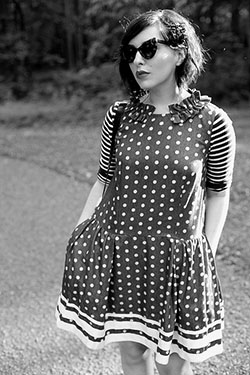
Jo of Lost in the Haze (left) and Keiko of Keiko Lynn (right) both show this idea of neutrals. The stripes and polka dots don't compete with each other. Even the bolder stripes on the bottom of Keiko's dress don't immediately draw your eye. Mixing these two prints are an easy way to incorporate mixing patterns into your outfit without fear of going overboard.


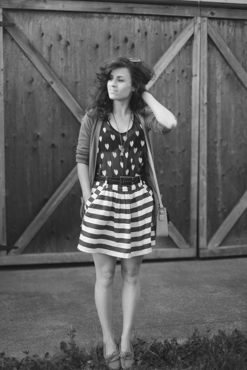
Liz of Delightfully Tacky takes this idea one step further by instead using hearts as a neutral pattern. These are neutral because they are very similar to polka dots. Generally, any repeating pattern could be considered a neutral pattern. Also since both of these patterns are the same height, one doesn't outshine the other. If the hearts were smaller, then the stripes would be the focal point, and vice versa, which certainly isn't a bad thing.


Size of the pattern does play a part, and I've always heard that you shouldn't mix two big, bold prints together, or two small prints together, but instead have one big pattern and one small pattern. A lot of time, however, I've found this not to be accurate. Patterns are similar to colors in that similar patterns often mix well, as well as opposite patterns.

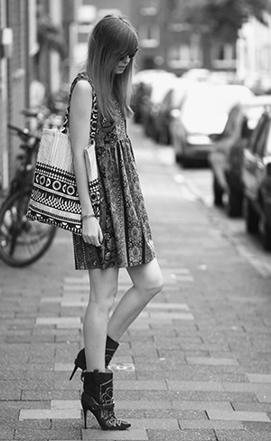
A good example of similar patterns mixing comes from Jana of Bekleidet. Both of these patterns are big, but they have a lot of similarities. They are both pretty geometric, with circles and straight lines. In fact, the lines and circles in the pattern on the bag play off of the neutral stripe and polka dot idea.

That's the great thing about patterns, most of them link back to their hue, if you will, of stripes or dots. And that's the reason every print works with every other print--because of its origin (where people go wrong is with the color of the prints, but we will discuss that tomorrow).

You may also notice that her boots have a pattern on them. Even though this isn't a fabric print, it still affects the overall look. But because the pattern also has geometric lines like the other two, it works well for the entire outfit.


Ali of The Drawing Mannequin shows how a neutral print on her socks works with the big print of her dress. The pattern on her shoes also works because the organic shape matches that of her dress.


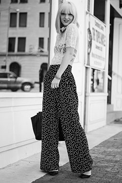
Olivia of La Voyageuse utilizes the lace texture of her shirt to act as a print alongside the neutral polka dots on her pants.


In my own outfit, I have a leopard print shirt, a floral dress (as a skirt), as well as polka dot tights. Floral is an organic print as well as animal prints, so they both work well together. Also, and I will give more examples of this tomorrow, since my leopard print shirt is in a neutral color, it automatically goes with my floral print. While it is necessary to look at the patterns in black and white to see how they respond to one another, if every print were in black and white, no one would have trouble mixing them. It's because of the color that gets people hung up.


takeaways:


1. Polka dots and stripes are neutrals. They go with any other print, including other neutrals.
2. Prints that are similar (two organics or two geometrics) go together, as well as prints that are opposite.
3. Basically, any print goes with any other print. Where people fail is in the color of the prints.
4. To slowly incorporate more prints in your outfit, wear either two neutral prints or one neutral print with a big print.


I do realize that this post basically gave no help because I said that all prints go with all prints, but as far as I know it's true. If you have any questions about this post or anything about mixing prints, please don't hesitate to contact me! I would even be more than willing to help you pair prints together in your own outfits and give advice where I can.

Tomorrow we will be looking at how color affects prints, which will be like the finishing touch on this post. I'm also going to talk a little bit about different types of fabric and how that affects outfits as well, so stay tuned!

Have a great day. :)


Tuesday, June 25, 2013

mixology 101 // color


First of all, I must begin by saying that these are just my opinions and may or may not be textbook accurate. But from what I know and have experimented they are true and they work for me, so I hope they work for you!

Second of all, get rid of all notions that one color doesn't match with another, because it's not true. Because colors exist in nature, they are all harmonious with one another. Where people go wrong is in the amount of combinations of colors they wear. Today I'll be showing you some examples (a lot actually, because I couldn't bear to not include some of my favorite bloggers) of colors you may not think work well that actually do.


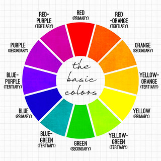
When it comes to color, there's a vast amount of knowledge about the subject. You can read all about color on the internet, but one website I find especially helpful is this one. For now, we will start with the basic color wheel. These are the most basic colors, or hues, and from them come every color you see. Tints are the lightening of the twelve basic colors (think pastel colors). Tints are achieved by adding white to colors. Shades of colors are achieved when you add black (generally) to the twelve basic colors. (In painting, instead of adding black, you add the opposite color on the color wheel, i.e. add red to green to make the red darker, to not compromise the vibrancy of the red, but that's a different topic.) A tone is when you add grey to a color (think muted colors).

Now remember, all colors go together. You can mix (and I mean mix in the sense of pairing two different pieces of clothing together) a tone with a shade with a tint, of any color, with any color. There are plenty of examples below where people have done this successfully. The general rule, however, is that a color in close relation to another will compliment it. For example, colors next to each other on the color wheel (called analogous), or those opposite each other (complementary) fit well together. But now let's look at some examples to see the colors in action.


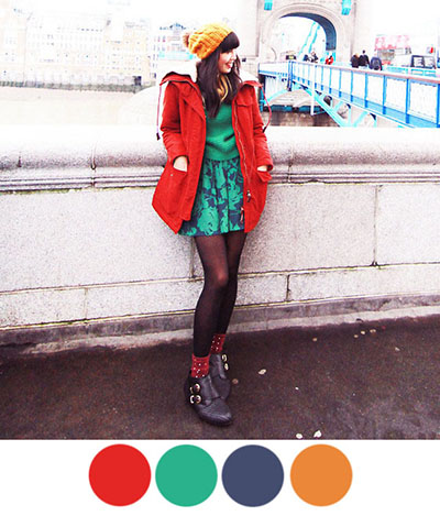
Connie from K is for Kani is the perfect contendor to begin with. I've long been a huge fan of her fun colors and she has an amazing knack to match things together. In this outfit specifically, you can see how she used complementary colors to her advantage. Her two main colors are both tones of red and green, opposites on the color wheel. She uses the yellow-orange tone as an accent color, which is in between both the red and green on the color wheel. Because she stuck with two main colors and an accent color, and because they were all tones, this color combination worked.


Question: How can I add more colors into my outfits easily?

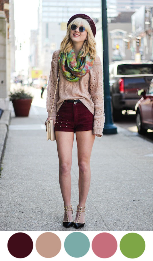
Olivia of La Voyageuse is a great example of incorporating many different colors into an outfit. If you're nervous about adding a lot of color to your wardrobe, start with one piece at a time. In this ourfit, Olivia had a multicolored scarf with greens and pinks and blues. For this outfit specifically, she chose to add to the pinks of the scarf with (a shade of) red shorts and (a tint of) red sweater, allowing the blue and green (which are analogous colors) to be her accent colors.


Similarily, Katie of Alaskan Weredork (left) used her scarf as the main focal point, pulling from the greens in the scarf to match her shirt. A way she could remix this scarf would be to pair it with a yellow or blue piece of clothing, since both tints are also in the scarf.

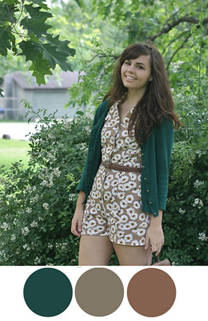
Lauren of Someone like You used her neutral daisy romper as the main focal point, and a dark green as an accent color. This also brings up a good point about neutrals. Neutrals consist of browns, blacks (to include greys), white, and navys, and they go with any color (be it tints, shades, or hues) including other neutrals. (Whoever told you that brown and black don't go together was lying to you.) Because Lauren's romper consists of neutrals, she can pair any colored cardigan with it. Perhaps a red orange cardigan with a blue green belt (complementary colors)?


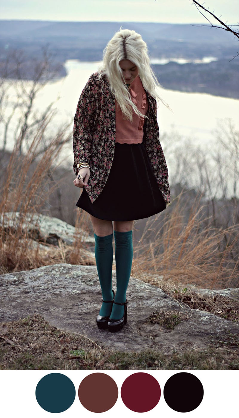
Hannah from Styles by Hannah Riles does an excellent job of showing how to pair shades of colors together. A beautiful maroon color next to a deep teal blue color is one of my personal favorite color pairings. In this case, because maroon is the most prominent color, the blue acts as a compliment. The tone of red also works because it is related to the maroon color. Even though they are two separate colors, they can be classified as one since they share the same hue: red.


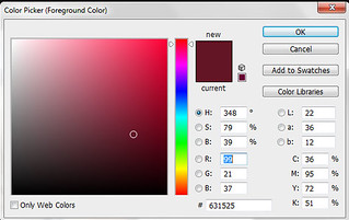
If you hold your mouse over the left image, you can see how perfectly the two reds relate to each other. One is more of a tone, one is slightly closer to purple on the color wheel, but they both share the same shade (both have the same amount of black in them).

It's important as a general rule to keep your outfit to one or two main colors with one accent color.


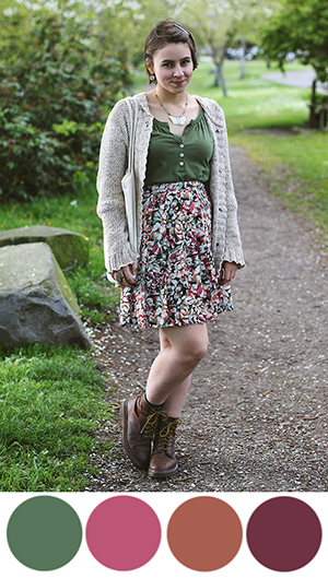
Elanor of Missing Lovebirds (left) has the perfect outfit to showcase this rule. Her main color is this tone of green, with one accent color of red. The swatches of red that I have highlighted, of course, are in various tones and slightly different positions on the color wheel (some leaning towards red, and some leaning towards orange, but they are all derived from the hue red. Plus, it's easy to combine these reds because they are already together in one skirt.

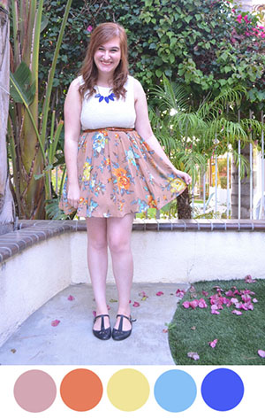
Elana of Room 334 (right) also has a similar skirt to showcase this concept. She took the tint of blue in the skirt, and went straight to its hue in the pairing of her necklace.


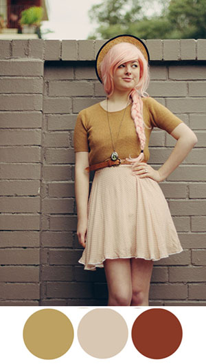
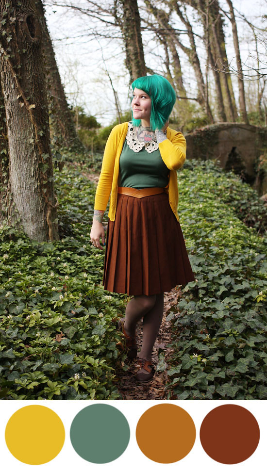
Some more examples include Annika of The Pineneedle Collective (middle), pairing neutrals with a tone of yellow and her pastel pink hair; Kaylah of The Dainty Squid with a beautiful earth toned (ie browns, greens) outfit with a yellow cardigan (which plays off of the yellow-orange in her neutral browns); and Jessi of Haircut and General Attitude in bright analogous colors of red (pink), orange, and yellow.

Despite what this post suggests, this isn't an exact science. You can't go around with an eyedropper tool to sample every color you come by, though that would be incredibly cool. I learned everything I know from trial and error, and mostly from just instinctively seeing what looks good together and what doesn't. It was only in preparing this post that I saw how refined color mixing actually is. But that doesn't mean you have to make it refined. In fact, I want you to break all the rules I just gave you and wear whatever colors you want! That's the joy about personal style: you wear what makes you happy. But as far as I know, these are the best guidelines to mix colors together for one cohesive, stylish look.

takeaways:

1. All colors go together. Some just happen to go together better than others.
2. Neutrals are your friend. Browns, blacks, whites, and navys go with any color, including other neutrals.
3. If you're looking to slowly incorporate color mixing into your outfit, go with a piece of clothing that features many colors.
4. Above all, experiment. Always keep an open mind to color. Some combinations may surprise you!

If you have any further questions on color or need clarification on anything I've talked about, please don't hesitate to ask! I will be happy to answer your questions and give you more examples and help you mix color in your own outfits.

Tomorrow we will be looking at patterns and how to mix them, so be sure to check back soon.

Have a great day!