That's right! Introvert's Introduction got a facelift. In honor of my blog's six month birthday, I thought I would give it a much needed update. I may tweak this design a bit in the future, but for now I'm happy with it. There's a new contact page, prettier navigation, and a spotlight for any current giveaways I have going on.

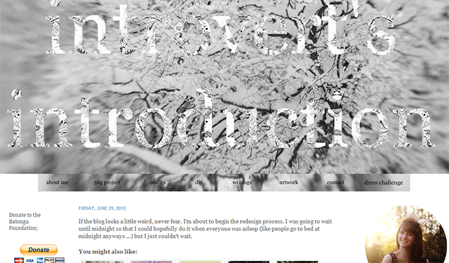
This is what the blog looked like before. I loved this design, but began to feel like it was a little too depressing for me. So I went the exact opposite route of black and white.
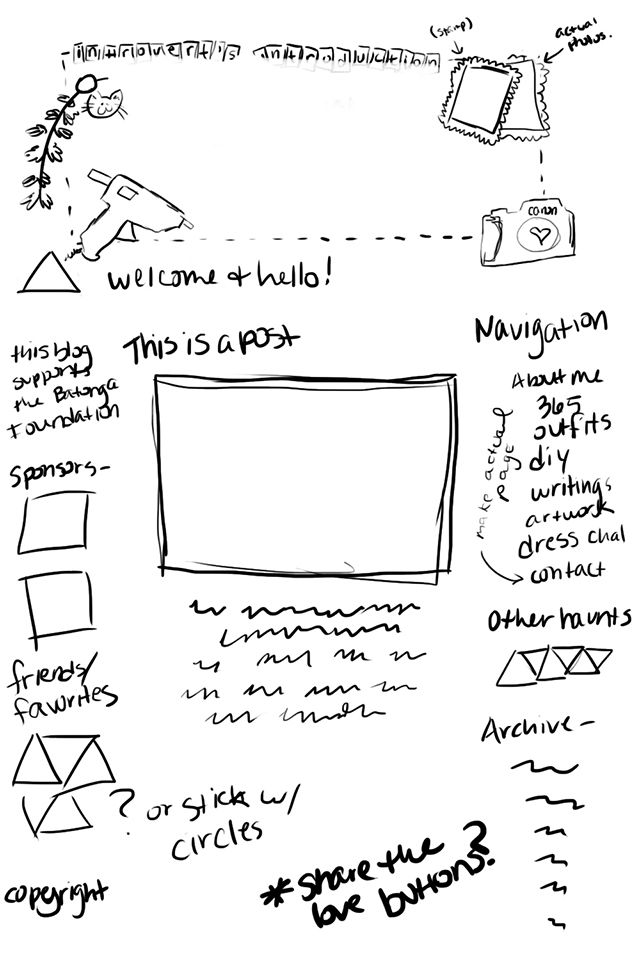
Here's an image of my first sketch of the new design.

As you can see the final product is slightly different from the sketch, but I wanted to keep things nice and neat and not over-complicated (of course, the actual coding was a bit more time consuming than I had anticipated, but I fixed all the problems).
I hope you guys like the new design! Let me know what you think, if you have any suggestions or comments. I would love to hear them.
Have a great day!
